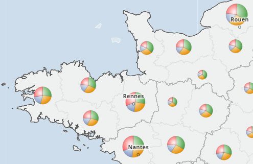
 Sector charts map: combined representation of an indicator in absolute values, divided into several categories
This kind of map represents the distribution of a number into several categories. The indicator is an additive value, so it is represented by rounds of proportional surface area. Each round is divided into as many sectors as categories: grouped age ranges, major economic sectors or types of activity.
This representation is only valid if the number of geographical units on the map is not too large, for example departments or regions. As well, the number of sectors should remain limited to 4 or 5. Not following these principles of common sense would lead to an unreadable map.
The illustration shows the distribution of the population over 25 years old by level of education. The surface area of the diagrams is proportional to the number of people over 25 years old. The larger the sector shown in red, the higher the share of high school graduates (the other categories being: no diploma, CAP/BEP or baccalaureate).

